

Per Capita Statistics
The Wrong Answer

Many, many moons ago, I wrote a succession of posts on 𝕏 about the weaponisation of per capita statistics by those on the right.
It feels prudent to bring those posts back to the forefront, as I’m seeing more and more social media posts that misuse these data points in order to demonise asylum seekers.
People like Matt Goodwin, all round failed academic and far-right, Reform UK mouthpiece is a prime suspect in this field — in fact, I just looked at 𝕏 and saw the post below [even though he blocked me, I still get force-fed his posts because 𝕏 thinks I need to see them 🙄].
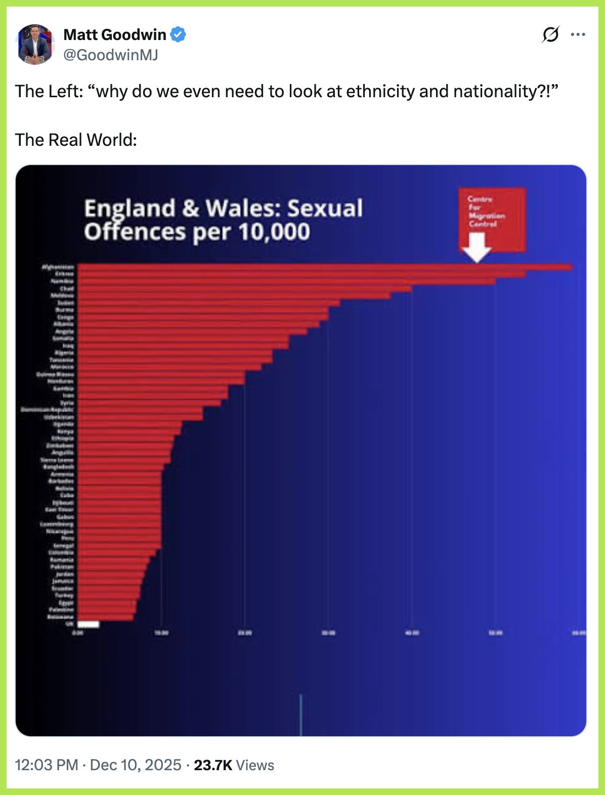
I’m going to come back to that very graphic in a bit as it’s the one most used by the far-right claiming to show that you are more likely to be attacked by an Afghan man in the UK, than anyone else. Spoiler alert 🚨 — it’s nonsense.
So we begin, as we always do — it seems to be my ‘thing’ now — with a bit of historical context.
Modern demography — the statistical study of a population — began in 1662 with a man called John Graunt. Graunt was an epidemiologist but is now considered the founder of demography, as we know it today. In his publication, Natural and Political Observations upon the Bills of Mortality1, he considered the concept of the ‘average person’ within a population.
In 1690, a book called Political Arithmeitk2 [sic] was published by William Petty, this calculated the average income per person in some regions — an early form of per capita economic statistics.
Throughout the following decades and centuries, the idea of the ‘average man’ became more useful in comparisons between regions and as industrialisation took off, the need to compare economic performance became necessary, leading to the adoption of GDP per capita in the 1930s to measure national prosperity.
OK, that wasn’t too bad for a history lesson, was it? Now I’m going to move on to more current times.
Let’s get something clear from the outset, I don’t dismiss the usefulness of per capita data outright, it is exceptionally useful to make meaningful comparisons at an international or population level. My beef is that it is being used to provide a set of large numbers that look scary in a chart, giving the illusion that things are far worse than they actually are — see the example above as a prime example.
This has been happening for some time across the opaquely funded halls of Tufton Street and their varying minions that perpetually grace our TV screens, but the incident that caught my eye back in May was a statement in the House of Commons by then, fairly unknown, Tory MP Katie Lam.
In an immigration debate to-and-fro, she reasserted a previous claim by Chris Philp — the Shadow Home Secretary — that Afghan men are twenty times more likely to be sex offenders. Watch the clip.
The number that Lam refers to is the very same number that is displayed in the glitchy graphic above. A number that uses per capita statistics to skew the facts in favour of their anti-immigration argument. These figures are sourced from the Centre for Migration Control, a [far] right think tank run by a man called Robert Bates, and highly linked to Reform UK.
Bates was a Research Executive at Get Britain Out, a campaign advocating for Brexit, and subsequently an activist and campaigner for Reform UK during the 2024 election run up.
His political partisanship curries favour with those on the more hardline of the right in British politics, and now supplies spurious data about immigrants that is hoovered up and spat out again by the likes of Goodwin and Jess Gill — an extremely right-wing commentator active on social media — via his Substack called Migration Central.3

The Good Law Project highlighted this particular organisation back in September in a wider piece about the weaponisation of immigration. Their excellent piece is well worth a read.4
You can check his stuff out for yourself but, for the most part, the data is unreliable and highly distorted to disparage immigrants to the UK. It nearly always uses per capita stats to ‘prove’ his points, so let’s see why that doesn’t hold up to scrutiny, and why, in my opinion, MPs should never be allowed to use this data as a reference point or as evidence in a debate.
Per capita, as a premise, averages out data about a certain group of people and then compares them against each other. That’s a very rudimentary description and slightly reductive, but for the benefit of this article, it works as a baseline.
But, this is where the entire issue lies, with using this data across a broad spectrum of people — the multifactorial dimensions within a demographic are vast and, often, uncomparable. Let’s dive into crime stats for some examples, as they highlight the glaring issues with per capita data across multiple groups.
Most crimes in the UK are committed by men in the 15-35 year old bracket. That covers all crime across the country. Let’s break it down a bit by immigrants and native UK residents to see how things stack up.
The majority of immigrants to the UK falls within that 15-35 year old bracket, so, as a standalone figure, working age men are more represented overall.
UK born population figures include a disproportionate amount of elderly and children — far less likely to fall into the crime bracket, so immediately, you can see how the numbers are starting to skew.
So even if two groups behave identically, the migrant population will appear higher per capita, simply because they have:
more people in crime-prone age ranges
fewer very low-crime groups (children and pensioners)
To really compare these two, very differently structured demographics, there would need to be statistical controls put in place that account for:
age
gender
region
socio-economic status
education
employment status
duration of residence
type of migration
policing intensity
These controls make for an infinitely more nuanced dataset, but, at the same time, make it far more difficult to process.
When researchers do this, the gap between migrant and native crime rates, normally disappears entirely, and can often show lower crime rates among migrants.
The Home Office and most criminologists caution against using basic per capita comparisons for exactly these reasons.
Despite this, we are continually subjected to these weaponised figures and people like Matt Goodwin have made a lucrative career by misleading people with complex data. Data that can easily be dissected if he is put in front of the right people — see one of Mehdi Hassan’s awesome takedowns for an example.5 There are plenty of other examples out there, of Goodwin being laid bare for his statistical misuse.
Unfortunately, we are now in a political window where Reform UK and the far-right are in constant campaign mode … Reform held three press conferences a week for a month, with barely any announcements except that they were going to halt immigration. Unsurprisingly, plenty of per capita numbers were thrown out with zero context or control applied.
Of course, you are not more likely to be attacked by an Afghan man in the UK — their population numbers here are vanishingly small [≈ 100,000 or 0.15% of the entire population], but, per capita, if you had an equal amount of UK white men and Afghan men, then you could almost claim this to be true but that still ignores the mitigating demographic data I talked about above.
Per capita stats, for crime and immigration data, is a hypothetical average; it is not real-world data. It works for those on the right though because, in some situations, the per capita number is higher and therefore can be weaponised into a scary graph or chart. By trying to be specific, which this information should always be, it indicates that the per capita number is purely hypothetical.
Most of the charts, used by the far-right to show that a certain demographic is more dangerous than their platonic ideal of a white British man, list the percentage data alongside, but this is ignored because it doesn’t back up their racist motives.
Here’s a chart from the Home Office that shows total number of crimes in the UK for 2023.

You can see that the overwhelming majority of crimes are perpetrated by white criminals, but when placed into a per capita bracket, it indicates that black criminals are far more prevalent — by more than twice the amount. But as you can see from the real-world figures, you are far more likely to meet a white criminal because there are just so many more of them.
This highlights my entire point. If you were only presented with the per capita column, it paints the black community in a terrible light — white criminals place third. But, faced with the real-world information, you now understand that white people commit way more crime … by orders of magnitude.
People like Goodwin only present you with half of the data; it’s a well-worn tool of the far-right. Big numbers equal far scarier statistics, but they never tell the full story.
I hope this article may prove a useful tool in the combat of disinformation in the immigration debate. I think it’s vital that we fight back with the truth and precise detail. When confronted with details, their rhetoric crumbles.
If you made it here, thank you. If you haven’t signed up, then please do — it doesn’t have to be a paid subscription. I will put out my main pieces for free, but I don’t get paid for anything I do here, so if you are feeling generous, I would be eternally grateful, and you’d be helping me get stuck into more investigations. No worries if not, though. 😃

Source — Bills of Mortality by John Graunt
Source — Migration Central Substack
Source — The Good Law Project
Source — Al Jazeera English on YouTube
In the United States since 2018 according the CDC's WONDER database of causes of death, 15-34 year old black males were 23 times as likely to die by homicide as 15-34 year old white males. They were about 40 times as likely to die by homicide as Asian males and, perhaps most interestingly, about 5 times as likely to die by homicide as Hispanics, who are fairly comparable in income and education.
Those are some amazing racial differences that can't be honestly adjusted away by your techniques.
This is really just counterfactual piffle. Whether figures have been “normalised” for age or sex is beside the point. In the real world, if a defined cohort is committing certain crimes at a higher rate than the general population, that has real-world consequences.
Pointing out that the cohort contains no women, children or elderly people doesn’t make those consequences disappear. Nor does it matter that the cohort isn’t a representative sample of the population as a whole — no one serious is claiming that every individual within it is more likely to be a criminal.
The issue isn’t moral judgement about individuals; it’s outcomes. If crimes are occurring at a higher rate than baseline, that is simply a statement of fact. Explaining why that rate is higher does not negate the fact that it is higher.
Dismissing the problem with statistical caveats may feel virtuous, but it is irrelevant to the practical question society is dealing with. You can acknowledge over-representation without asserting collective guilt. Conflating the two is precisely how this debate gets muddied.